Enhancing Splitwise Premium Conversions with Redesigned Plans and a Referral Program

Research, Prototyping, Interaction & Visual Designer
Figma, FigJam, ChatGPT, Freepik,
Adobe Illustrator
Case Study · FinTech

Splitwise is a financial app designed to simplify expense tracking and cost-sharing among friends, family, or roommates. It allows users to easily split bills, track shared expenses, and settle balances, whether for group trips, household expenses, or casual outings. With features like automatic calculations, reminders for payments, and integrations with payment platforms, Splitwise ensures transparency and convenience in managing shared finances.
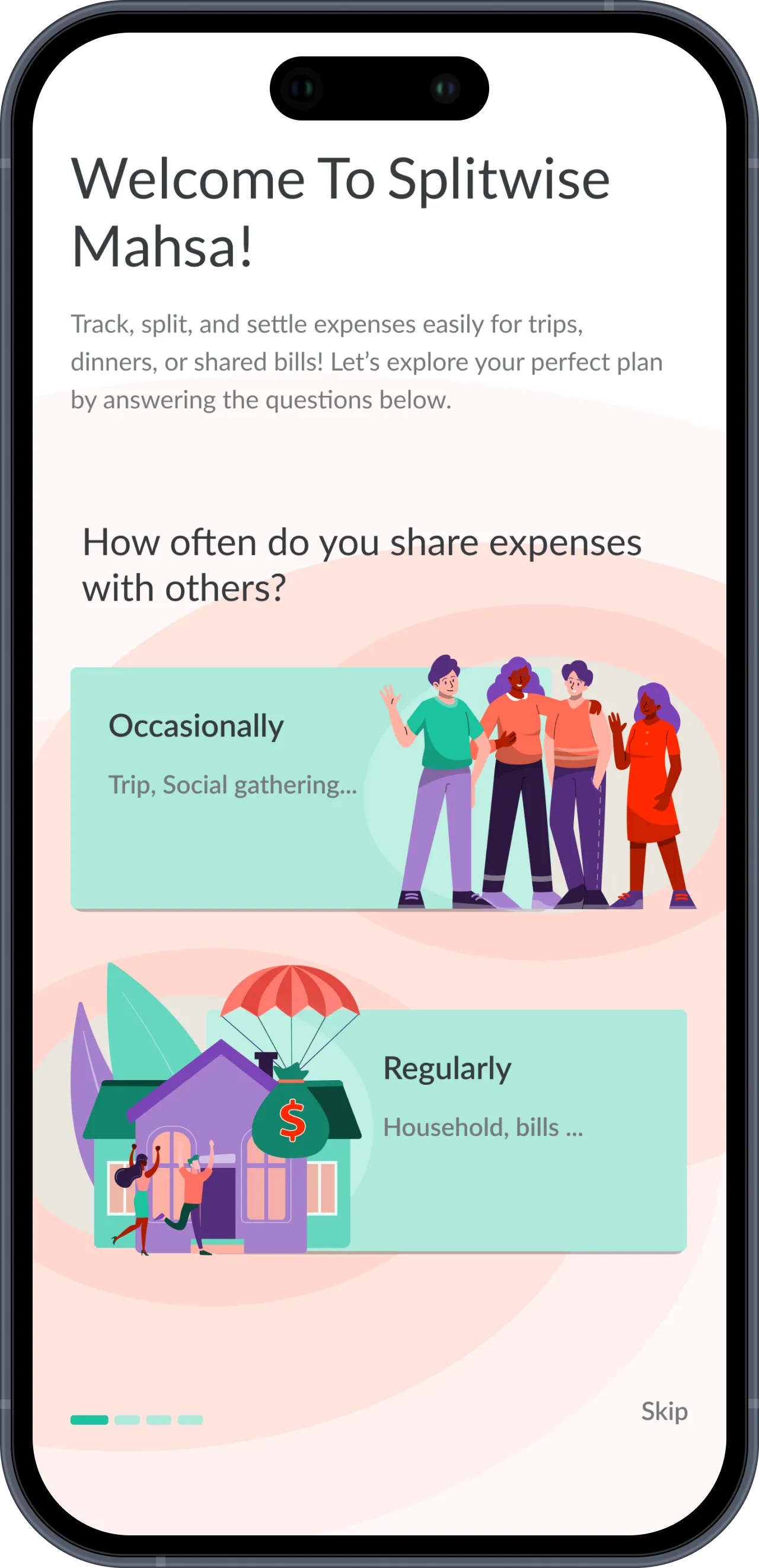
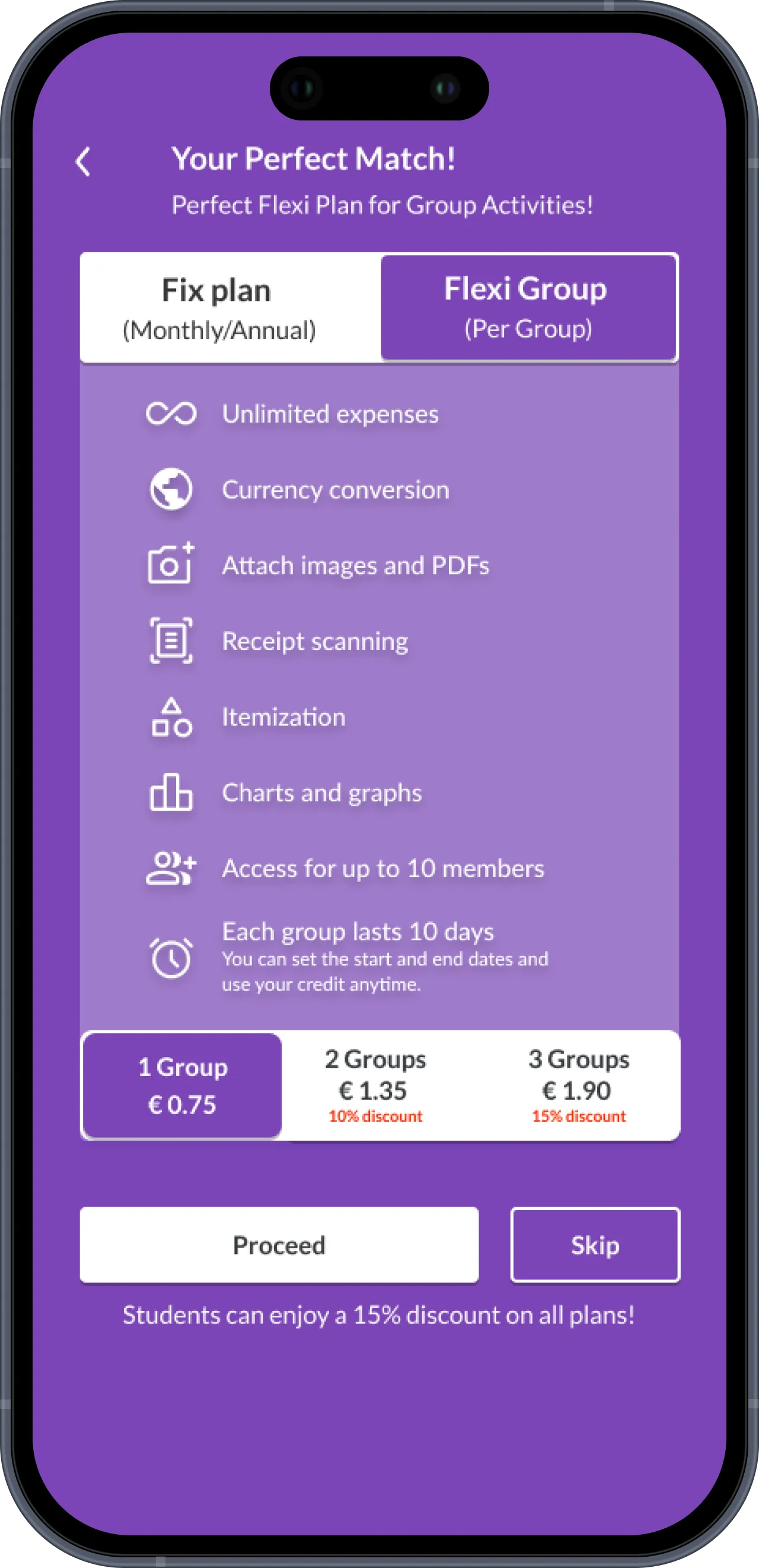
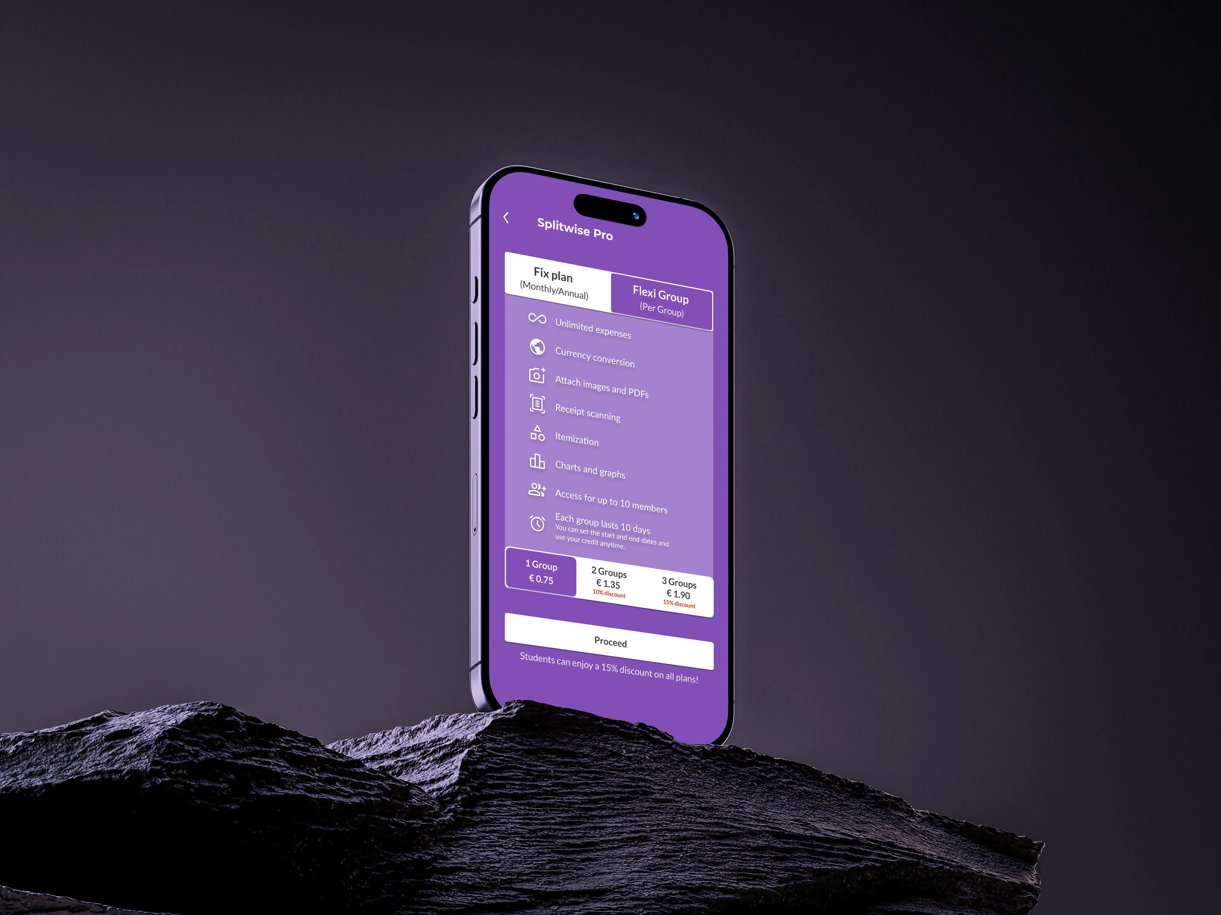
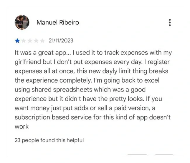
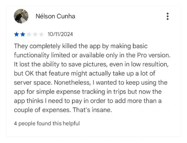
The freemium version of SplitWise imposes significant limitations, such as restricting users to only three expenses per day. Additionally, the premium offering is presented in a way that feels intrusive, discouraging users from upgrading and leading to a decline in conversion rates.


Who are the target user groups for Splitwise?

A young traveler who uses this app to split expenses with friends 2-3 times a year.
I use Splitwise for group trips, but the four-expenses-per-day limit is frustrating for me and my friends. Since I only travel a few times a year, I don’t see the value in paying for a monthly subscription for something I rarely use.

Couple that use splitwise to share living expenses together and see all their expenses.
The most problem is manually entering process like typing that is time-consuming. Busy schedule forces us to enter every 2 or 3 days so sometimes we miss some items.

A group who uses this app for gatherings and buying gifts for special occasions.
When i have to send repeatedly payment reminder without seeing payment status of others is annoying for me since in some groups; we are not really close with each other so can not trust completely.
What Makes Conversion So Challenging?
To gain deeper insights into user behavior, we conducted six in-depth interviews that revealed personal experiences, key pain points, and opportunities to
improve conversion rates.

"The app doesn’t give much guidance on how to use advanced features; I often have to figure it out myself."
"The Pro version page keeps popping up, but I don’t really know what features it offers, and I haven’t found a reason to upgrade yet."

"I hate that there are limits on logging expenses; it’s such a basic need for group spending."
I’m only travelling once per year, it doesn’t make sense to pay a subscription every month
After analyzing the data from our interviews, we identified recurring themes and patterns, which allowed us to uncover the primary insights and challenges highlighted by the participants.
The current packaging of the premium features is not aligned with a large user group
Managing group debts becomes confusing without clear summaries.
Users have difficulty finding advanced features or guidance.
After analyzing competitors in the expense-sharing app market, key trends and opportunities emerge. Apps like Tricount and Splid offer features like multiple currencies, categorized expenses, and Excel export but lack default expense options and bank connections. Settle Up and Buddy stand out with tools like receipt-based auto-filling and basic budgeting, but have limitations in notifications and data entry.Premium plans often include offline access, advanced reporting, and receipt integration, but there are gaps in seamless payments and advanced OCR/STT technologies. This points to opportunities for innovation in automation, recurring expense management,
and a better payment reminder system.
How might we help travelers use Splitwise efficiently to meet all their needs and enhance their trip experience while encouraging them to use premium plan?
By adding a “Flexi Group Plan” plan → Allows travelers to access premium features without committing long-term.Simplifying Reminder Setup →
for group members to pay their split
How might we improve the Splitwise experience for couples sharing expenses so they see more value in upgrading to premium?
Customized onboarding pages with unique characters for different personas → Tailors the experience for couples, highlighting relevant premium benefits.Customized messaging/icons → Creates a more relatable and intuitive experience, increasing perceived value.
How might we make it easier for students to understand premium features and recognize their value in order to encourage them to subscribe to the premium plan?
Special plan (with discount) → for students on premium planThe Referral Link feature
→ Encourages students to invite friends and get benefits, increasing adoption.
Onboarding pages are now categorized by user purpose, with tailored UX writing for each plan and unique illustrations that showcase the distinct features of every option.


Clicking the Splitwise Pro button now reveals two options tailored to different needs: the Fixed Plan, with flexible monthly or annual payments for regular users, and the Flexi Group Plan, ideal for occasional use such as group trips, offering full access for up to 10 members in a single group for 10 days, with a customizable start date. The updated design highlights Splitwise Pro and the Referral Link in a streamlined layout, while preferences now include easy access to referral status and group credits.
Payment status is now represented more clearly with a color-coded system—green for settled payments and orange for pending debts—paired with intuitive icons that indicate whether someone has cleared their balance or still owes money. To enhance clarity even further, a short message is displayed alongside each status.
What we learned
This project showed how important clear value communication and context-related UX are for conversion. It was especially important to realise that persona-based onboarding concepts, transparent status displays, and reduced complexity boost trust and make people more willing to upgrade.